The color scheme of a website is obviously one of the most significant design decisions that needs to be made. Choosing the proper colors for a website is certainly a very important step of the creative process. In this post we’ve listed some outclass examples of minimal color usage in web design. The sites that are featured in this post are using a simple color scheme of mostly black, white and gray. The colors in these designs and minimal but perfect for the design. These make the designs look elegant, graceful, chic and appealing. So check these examples out and get inspired.
More articles about this topic:
1. MyOwnBike
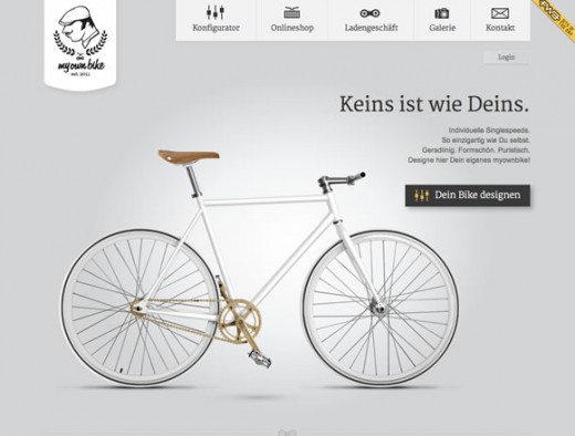
2. Webdagene

3. Frieze Magazine

4. David Airey

5. Shoshorov

6. Chrome Web Lab

7. Kershaw Knives

8. Big Bite Creative

9. LayerVault

10. Postmates

11. B&F

12. Cheshire Maintenance

13. The New Yorker
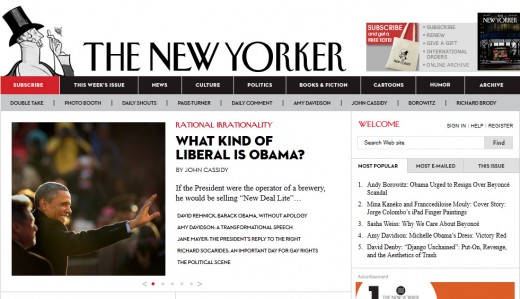
14. Rik Catlow

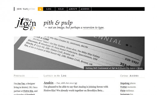
15. Jon Tangerine
If you enjoyed this post, please consider to subscribe to the feed and get future articles delivered to your feed reader.