The Internet is a great way to market your business or organization. But how can you make your website radiate your inner greenness? And how can you lower your websites carbon footprint so you’re not all talk and no action? Here are a few design tips to make your website cool, unique, and above all, green.
Decide on Your Tone
Before you can start designing, you need to figure out the kind of tone you want to set. Do you want it to be dark and sad so that people reading your website will feel the need to contribute and help your cause? Do you want to create a bright and happy theme so that you can show the world how well your business is doing and why it’s successful? Is rage and anger over an injustice your targeted emotion?
Whatever the tone you choose to set for your website, incorporate colors and images that’ll make people feel what you want. Choose your words carefully so that they convey the emotion you want your readers to feel as they browse your website.
Choose Earthy Colors
Green is probably the first color that comes to mind when people think of earthy colors. For a green website, it’s perfect because your audience will associate your website theme with the nature, along with feelings of freshness, tranquility, and relaxation. You can use any shade of green, but try to keep it complementing your overall theme. Bright greens are very eye-catching, and darker greens are more serious. But while green is a great choice, don’t limit yourself. For a unique twist, find or create a website theme that has browns and blues. These are Earthy colors, too, and will allow your audience to associate your website with green energy.
Images Make You Unique

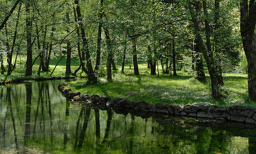
Image via Flickr Rudolf Getel
Now that you have your colors in mind, start thinking about pictures or images to add to your website for a beautiful and unique design that’ll help promote the tone you want to set. For a green website, you can never go wrong with nature. Find images of nature, whether its animals, plants, or even weather. All of these things make up the Earth – you can’t get any greener than that. If you’re website is for an organization or charity, include pictures of the work you’re doing to better the environment and its inhabitants. Always include your business logo or motto, so that your audience will recognize who you are.
Concrete Content
When you are adding information, statistics, or even opinions, make sure that you do your research. You’re creating a bigger carbon footprint when you create a website because of the energy it takes not only to design it, but the energy that’s used every time someone searches for something on the Internet. Don’t waste this energy on facts that you didn’t double-check. You don’t want to give people the wrong information. If you’re writing about your opinion on something, you should back it up with solid evidence so that people will take more seriously your opinion more seriously when reading.
Learn More about Energy Consumption

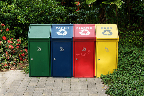
Image via Flickr epSos.de
Do a little research into energy consumption so that you know how to live a greener life, as well as help others live greener. Websites like www.electriccompanies.com can teach you more about living a greener life, and give you knowledge and resources to help you be a better energy consumer. Energy consumption plays a big part in everyone’s lives, even though most of the time it goes unnoticed. It’s important to be aware and act now, before it’s too late.
Creating a green website isn’t hard; incorporate green earthy colors paired with nature themed images and you’re halfway there. Whether your content is about energy consumption or not, it’s always important to stay informed so make sure you do all the research you need to feel comfortable that you’re providing solid information to your audience. By using colors, images, and solid content, you’ll be sure to create the tone you set out to design.