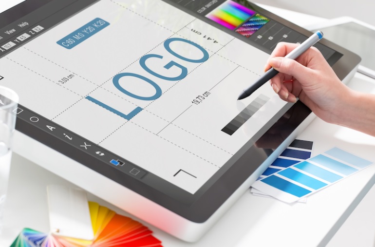
A logo is a visual representation, consisting of symbols and words, which aims to identify a particular brand. It should be noted that the design that represents the brand is a very important part of every marketing strategy.
Logo is an identification sign. Through it, the public will identify your product and / or service among many others. I don’t think I need too much to make it clear that the concern in making logos is a must, right?

What few people only know (or what matters) is that, behind logo creation, there is extensive research work, development that starts from the theoretical presuppositions of design and psychology, which involves semiotics, color, composition, concepts, etc. .
For this, a designer takes a long time to arrive at the ideal symbol, which is beautiful and functional for certain customer needs. However, if these professional costs exceed your budget, here are a few tips to help you create an efficient logo and resolve your problems at first glance.
These tips can also function to understand how the logo is made
Sometimes we employ a designer and don’t know how logos are designed, and knowing these steps can even help you become clearer and better align your ideas with professional people, have far more satisfying results.
It is important to remember that there is no “cake recipe” for making logos, every designer has his method. Here we give you an idea of how to create a logo.
First, we must understand that the logo must be simple
The logo is a graphical representation of your company and this must be synthesized so that it is easily identified without unnecessary information.
A very ornamental logo, full of
elements and effects to convey a sense of disorganization. You don’t want your
company image like this, right?
A logo is when we join an icon that gives the face of your brand that name.
This means that your logo is half “drawing” and the other half text.
And sometimes, besides your brand name, some supporting texts or slogans are
added. Therefore, this simplicity must also be stored at the source that will
write this text. Note that “source” is quoted in a singular form. It
is recommended to use more than one font in the logo.
Uniform typography on your logo results in visual compliance, everything works
better together, and you record in your customer’s visual memory your brand
name written in a particular source.
And that makes all the difference
Think of it for example Coca-Cola, Breitling Chronomat, Adidas, Disney … All logos of these brands have the same typography that makes us identify products at once. Have you ever heard that “nothing was made, everything was copied”? This is not exactly how it is, but having good references is very important to make an attractive logo.
Examples such as Nike, Coca-Cola, and Apple are always quoted because it is undeniable that these brands are market leaders in their segment and are easily recognized by their logos, right? In essence, the logo is something unique but still simple.