The practice of charity means the voluntary giving of help to those in need who are not related to the giver. Charities are often in the spotlight whether it be in the news or advertisements. This funding is carefully distributed and there are often more important things ahead of a generous budget for the website.
Today we have collected some really interesting and the best charity website designs. This list isn’t for advertising reasons, but if you ever have a few spare minutes while on the ‘net, check a few of them out.
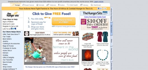
The Hunger Site
World hunger has been something that countries have been trying to end for decades. Sadly, numbers for those having to deal with hunger and starvation haven’t decreased much. With the Hunger Site, you easily click a button that donates food to those in need. Since its establishment, the website has been able to donate over 657 million cups of food throughout the world.
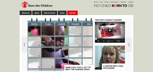
Save the Children UK
Here we have a great example of using soft and delicate colors. The donate button in this website design is red and is placed right at the top navigation menu.
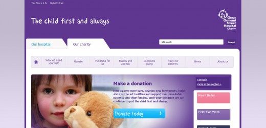
Great Ormond St. Hospital
One of the largest and well known charities in the UK, the Great Ormond St. website lends itself towards being very visual with the bright blue contrasting against the usual Great Ormond St. purple.
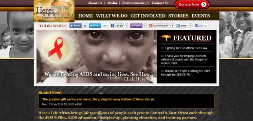
Here’s Life Mission Africa
Here’s Life Mission Africa has designed a trendy and visually sophisticated website that definitely calls for action from its users. The “Donate Now” button is in red and in a prominent position at the top of the web page.
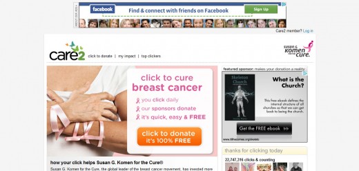
Prevent Breast Cancer
In recent months, breast cancer awareness has almost become a fad, with pink becoming the new black. With this website, a few clicks help to raise money for Breast Cancer Fund, in order to supply money for cancer research, testing, and outreach programs around the world.
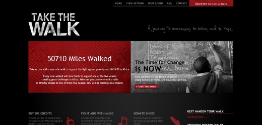
Take The Walk
The dark color theme of Take The Walk’s design is what sets it apart from other similar websites. Although the design is simple, it does grabs the viewers attention. The Donate button matches the color theme nicely.
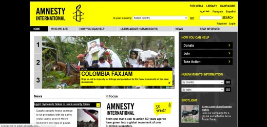
Amnesty International
This website design brings bright color into play with the amalgamation of black color to grab visitors attention. Donate and Take Action buttons are placed prominently.
Kiva
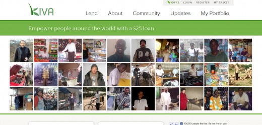
The website design of Kiva is far beyond the ordinary non profit website design. Not only does it feature a number of users that the website empowers with its services, but it also informs you about how the website works.
Free Poverty
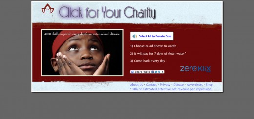
Have you ever wanted to learn your world geography while still being able to give back to the needy? Free Poverty allows just that. The website is a geographical game that anyone can play. No matter if you get the answer right or not, you are still able to donate a cup of water. If you do get an answer correct, you donate 10 cups of water. The website donates clean water to locations where fresh water is scarce or not available at all.
Oxfam America
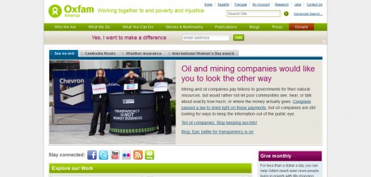
Here the website design is slightly more stylish as compared to other non profit site designs in this collection. The use of different colors is interesting to make a distinction between different segments while the Donate button is in red color to grab extra attention.
The Nature Conservancy
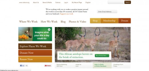
The color theme of this website is soothing and subtle. The whole design has been given a very natural and well accepted look with the Donate Now button in red near the top of the page as well as in the side bar.
Custodial Abuse
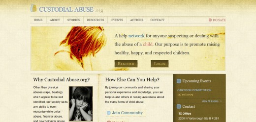
A vintage look is created for this website with a header that presents the navigation options uniformly.
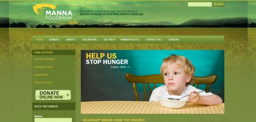
MANNA Food Bank
The MANNA Food Bank website design is in a shade of green that conveys the message of greenery and vegetation suitable for the cause the website is supporting. Donate Online Now button has been given an additional importance and stands out while looking very much a part of the page.
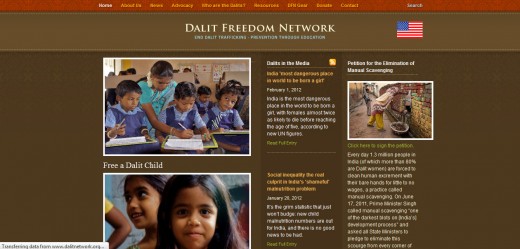
Dalit Freedom Network
This website design brings dark color into play with a combination of white used for the site content, giving it a compelling look. Also notice the Donate button, placed in the top navigation bar.
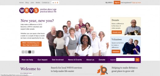
WRVS
The WRVS is quite small in comparison to the other showcase websites, however the use of color to section of parts of the website is well done. The WRVS brand was revitalised some years ago and has grown in the public eye because of their work with the UK Armed Forces.
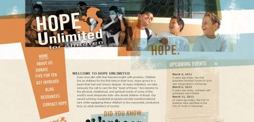
Hope Unlimited
Hope Unlimited website design is different and unique from other website designs as it does not have any header. Instead, it sports a sidebar that serves the roles usually reserved for the header.
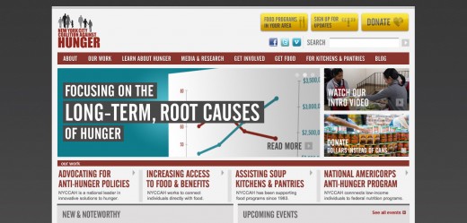
New York City Coalition Against Hunger
New York City Coalition Against Hunger website is an outstanding example of acquiring lots of information into a tiny space, while at the same time keeping the whole thing cluttered-free as well as user-friendly.
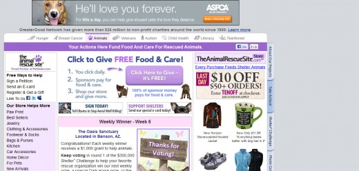
The Animal Rescue Site
If you’re one that loves animals and would love to give back, the Animal Rescue Site is a great way to donate a little bit of your time. A few clicks go a long way on the website. Each click donates food that is given to animal shelters and clinics around the world in order to provide for homeless animals.
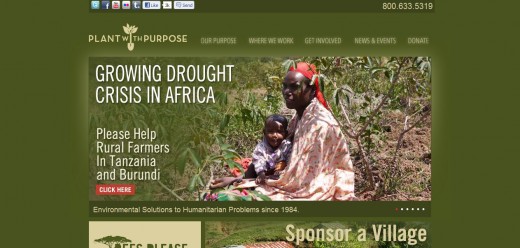
Plant with Purpose
Loads of green is used to excellent effect in this website design created for Plant with Purpose. The link to donate has been afforded a spot at the top navigation menu that suggests its importance over other elements.
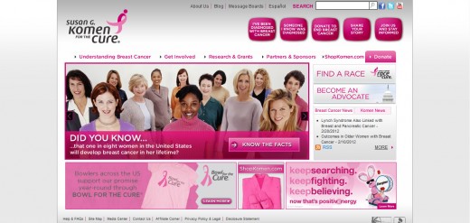
Susan G. Komen for the Cure
Here you’ll notice many shades of pink across the page, raising awareness of breast cancer and related diseases. The donate button is designed to draw attention while remaining in keeping with the color theme of this website.
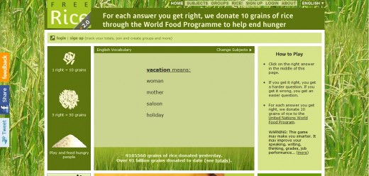
Free Rice
Free rice is the first charity website that I came across today. The website provides a game for users to play. You can choose between many different types of games. But while you’re having fun and maybe even learning a few things, for each answer you get correct, you’re also donating grains of rice to poor countries.
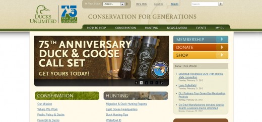
Ducks Unlimited
Ducks Unlimited brings typography and color into play to create an attention grabbing and compelling website.
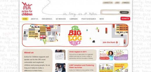
Action for Children
In this design, the designer kept the design simple and uncomplicated while giving it a very beautiful look. The Donate button is in red and is placed near to the top navigation bar.
Sower of Seeds
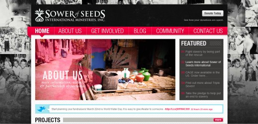
You’ll notice a somewhat unique level of contrast in the colors of this design. The designer very creatively blends black, white and pink colors in a single design. The Donate button is at the top of the page.
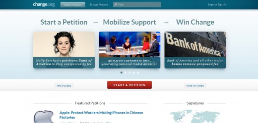
Change
This is a simple, uncluttered design fresh website design with delicate and nice color choices. The Start A Petition button is in red for emphasis while rest of the design displays a very subtle look.
