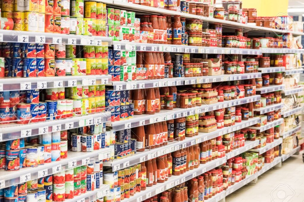
You can create the best product in the world. But, without the right packaging and labelling, it is not going to appeal to customers. This is particularly true in a crowded market. You are going to have a lot of competition and you have to ensure that your product is what stands out on the shelf.
Designing product labels can be challenging. Crafting eye-catching home goods labels is crucial for attracting potential customers and enticing them to choose your product over competitors’ products. You will have to take your time and plan your marketing strategy. You need to show you are different and grab a consumer’s attention.

Here are some tips on how to make your product label stand out on the shelf.
Include an Eye-Catching Logo
Think about when you see your favourite products in a store. They are instantly recognisable because of their logo. This impression is what you want to create with your product. So, when you are designing the label, make sure that your logo or branding is striking and visible. You can always simply the logo if it is going to dominate the whole level. But, you want to ensure that it can be seen from a distance.
If you have a range of products, it is best to be consistent and use the same logo. While the design can differ slightly, it is advised that they complement each other.
Use Professional Software
You want to ensure that your product label is sophisticated and looks professional. Thus, you need to use intelligent software in order to do this. Since it can be expensive to invest in this type of technology, you can choose to work with a printing company like IPW1. They are London’s leading print company and will provide you with the expertise and software you need to bring your label ideas to life. This can save you money in the long run and ensure that all of the labels are printed expertly.
Limit the Text
It can be tempting to include a lot of information on your product label. After all, you want to encourage your customer to purchase it and tell them all of the positive things about the product. But, there is a risk that you are going to overload them with information. The best thing you can do to capture a customer’s attention is to keep it short and sweet. While you want to include important details, keep it to a minimum so that they can read it quickly and decide whether they want to purchase it. This is particularly true for the front of your product label. Too much text is off-putting.
Prioritise Readability
You can spend a lot of time designing a label. This can include choosing a wonderful logo and a lot of bright colours and images. But, you have to ensure that your customers can read the information that you include on that label. Otherwise, it is going to be pointless. Ensure that all of the text you include is clear and easy to read. You can still have fine print on your label. But, make sure that it is sharp and readable. A simple way to ensure that your label is readable is to step back and see that you can view the name and branding clearly.
Do Not Be Afraid to Be Bold
Do not forget to have fun with your product label. This is your opportunity to show off your brand and what you are all about. Do not be afraid to be bold and different from your competitors. They are going to be next to you on the shelf and doing something different can be a good thing. It is going to catch the eye of consumers and make them intrigued to learn more about you. Therefore, experiment with various designs, fonts and colours to see what works best for your brand.
Consider the Product Shape
One thing you should consider when you are designing a label is the shape of the product it is going to be attached to. For example, if you have a bottle, you are going to have a label that stretches around it. If you have a small jar, the label might only be on the front. This is something you should consider so that you can ensure the information is printed where you want it to be. For example, you will want your main logo and design to be on the front, which could actually be in the middle of your label when it is printed onto a bottle.