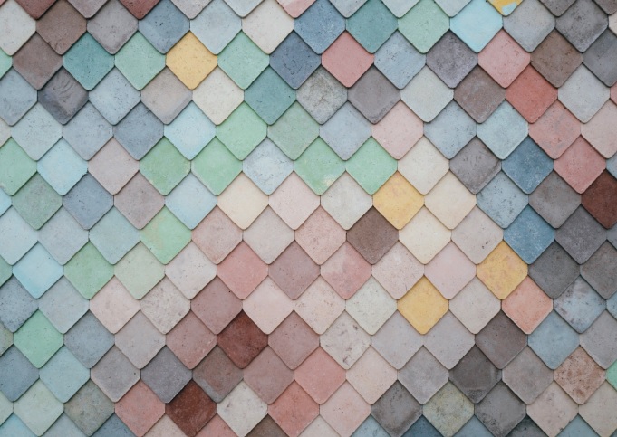
Understanding background design trends will help you create wallpaper that you can flaunt for your new website or use at home for your desktop.
Your website or computer’s background design makes a big difference in the feel you and others get when you look at it. If you fail to create the best background design possible, the look of your website or computer is going to fall flat.

The good news? We’re not going to leave you hanging. Continue reading this article to learn about 5 background design trends you should know to make your website look amazing.
Must-Know Background Design Trends
Whether you’re using Adobe Spark’s wallpaper maker or you’re trying to go it on your own, these background designs are going to make your new work of art pop.
1. Pretty Pastels
Pastel colors are really in now. Pastels give your website a fresh and clean look and are great for backing almost any images that you choose for your design.
If you want to create a fun and young looking website or computer background then pastels are where it’s at.
2. Concrete Textures
Going for a little more of a tough design? Concrete textures will give you the look of being “hard” and cool. If you have a website trying to sell hip products to young people then concrete textures could be the best background for your design.
There are a lot of different concrete textures to choose from whether you want to go with light with dark specks, dark with light specks or a consistent look throughout.
3. Duotone
If you want to create a fun vibe then duotone will help you do this. You love bright colors but you can’t pick just one — hello duotone. Duotone gives you the ability to tap into your favorite colors and pull the emotions out of your viewers — or yourself.
If you’re a fan of the eighties then these duotones can give you a major flashback and great vibes.
4. Exploding Dust
Want to make a statement with your website or computer background? Exploding dust is always fun and makes people get a feeling that your website is in action.
Exploding dust can be monotone or you might want to make it a very colorful design. It all depends on the statement that you’re trying to make so play around with it a little bit and see what feels right to you as you’re going through your design process.
5. Flat Colors
Flat colors are anything but boring when you pair them with some awesome graphics. One of the great things about using flat colors is that they aren’t trendy.
Yes, not being trendy is trending. Confused yet?
Flat colors allow you to keep your website design or computer background looking cool so you won’t have to change it out. If you use a passing fad background, you’re going to have to keep upgrading every time it goes out of style.
More Website & WordPress Fun
Now that you’ve learned about background design trends, what else do you want to learn? Bookmark your favorite parts of our website and come back to read more soon.