In our day to day lives we come up against so many iconic logos, but would they be as recognisable or seem the same if they had different fonts?
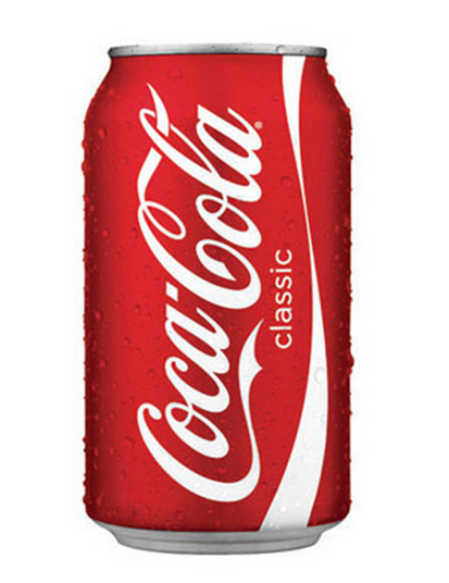
One of the biggest logos out there is the Coca Cola brand. The fun and flowing font really makes this logo successful. This logo is all text so the font is paramount here, and the liquid nature of the letters are reminiscent of the product within.

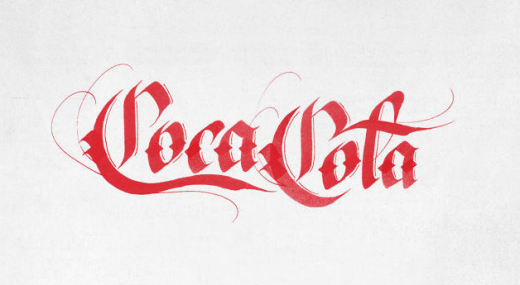
But try and imagine how the logo would seem if it had harsher, squarer letters or even older fashioned lettering like the example below.

The logo doesn’t read the same and so our psychological interpretation of the product is skewed, the Coca Cola represented by the second logo doesn’t seem as refreshing or fun to drink. The selection of a new logo font at a company as big as Coca Cola goes through rigorous testing and focus groups to get a unanimous answer as to what the font says.
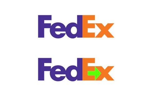
The famous Fed-Ex logo has was designed to look efficient and no nonsense, as well as carrying an arrow hidden between the E and X. This was done as a small nod to the creator’s vision of a parcel delivery service that is always moving forward.

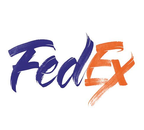
No nonsense is the approach that designers were hoping to achieve with this logo and the splash of contrasting colours keep it from looking boring. Consider this next example and how the logo looks with more of an artistic flair.

This logo reads as a more artistic, time consuming process which isn’t the message that this brand choses to portray. The font is the culprit for this change as it’s more languid and flowing, though the designer has still managed to keep the hidden arrow.
Logos that contain text with an element of the product are most successful, themed bingo sites use this tactic particularly well. Bingosweets has a successful logo that combines the two elements of its title, bingo and sweets. The logo is clad in sweet wrappers and also features a bingo ball, so immediately the brand is reinforced visually.

This brand also projects a fun atmosphere with this bright font, if the same site used an old gothic script, for example, it would be much less successful. The use of a sans serif, rounded font is perfect for what this brand is trying to portray.
The Ford brand logo font has not changed much over the years, it has become an integral part of the brand as it is so recognisable. Although the logos have become more up to date and modern the font stays the same, showing how important it is to the company.

This is the case with many brands with famous fonts such as Disney and Facebook and there are products that piggyback on this recognition. Disney door name plates are more popular than ever with children and it’s interesting that the font is so recognisable without the rest of the logo.

The more you think about logo fonts the more you realise the importance of them. A lot of work goes into the perception of the brand and the font is one of the most noticeable things about a logo. The very fact that we can recognise a font away from its logo shows how pervasive these fonts are in our day to day life. Next time you look at a logo take time to consider the message that the brand is putting across with the font and if they do it successfully. Noticing these things can be key to becoming a better designer and you can do it wherever you are.